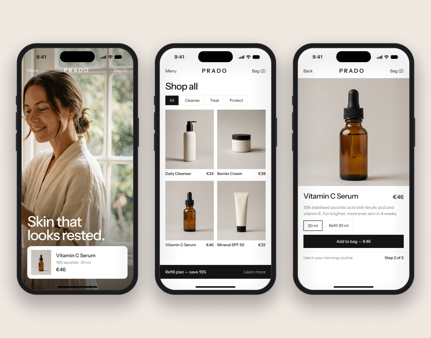
I wanted PRADO to feel warm and easy to shop. I kept the layout simple, with clear product information, room for the photography and sections that explain the daily routine and refill options.
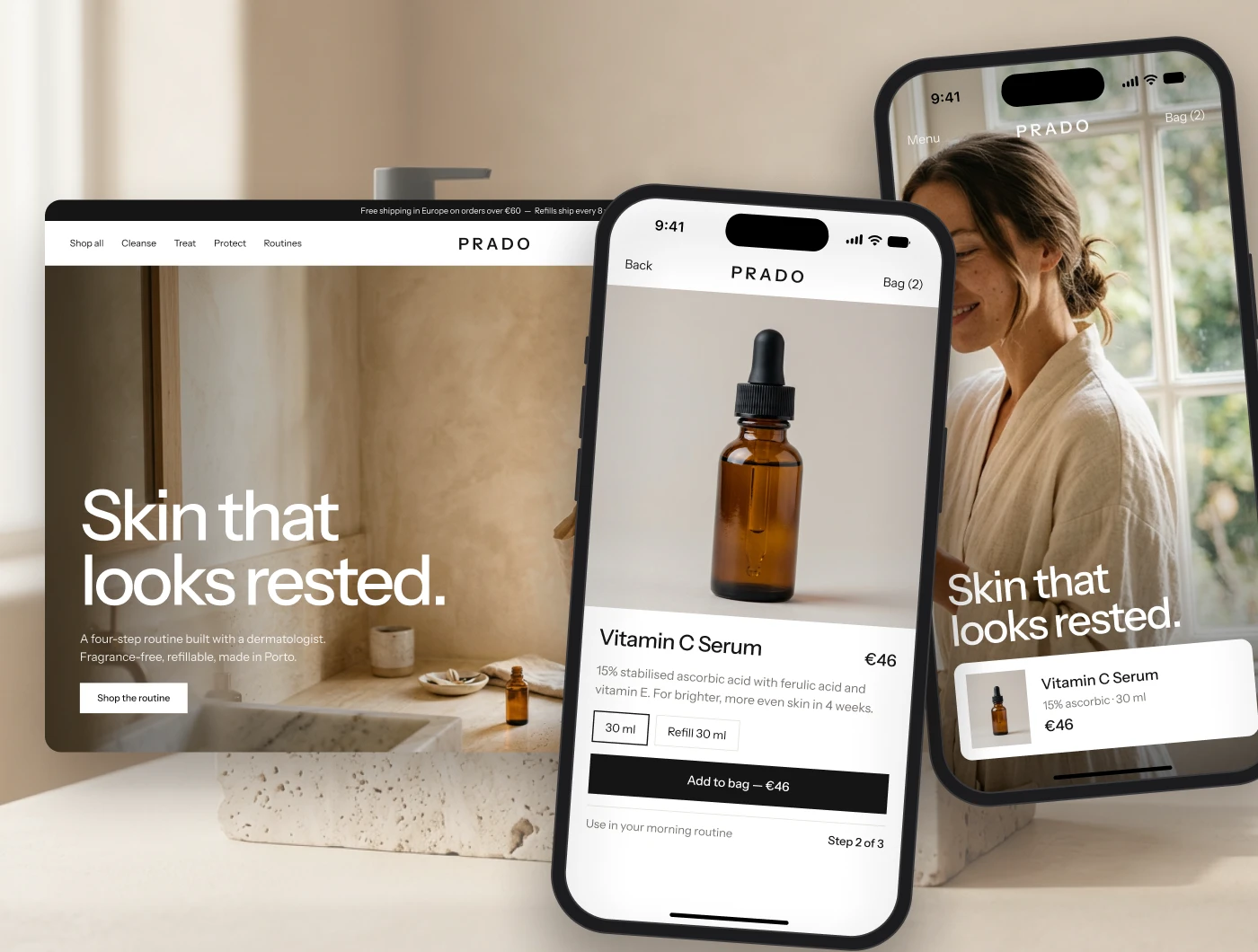
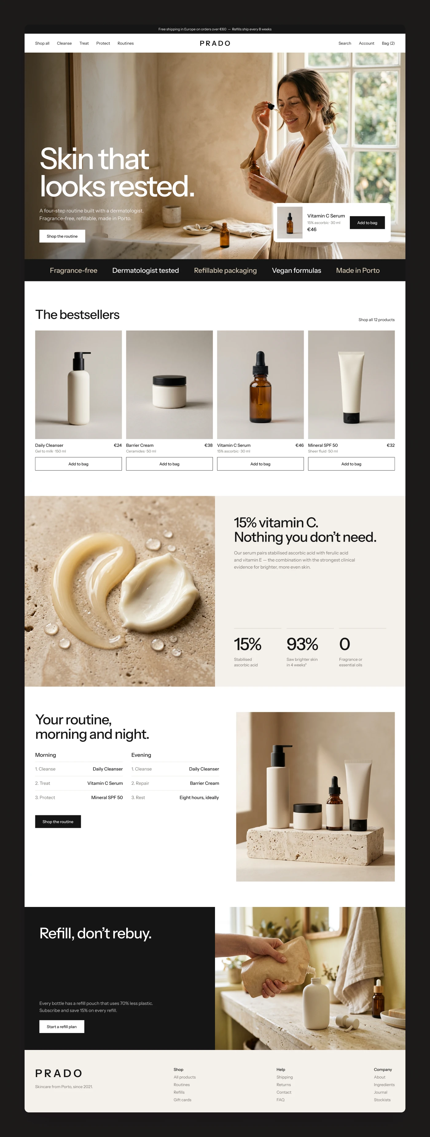
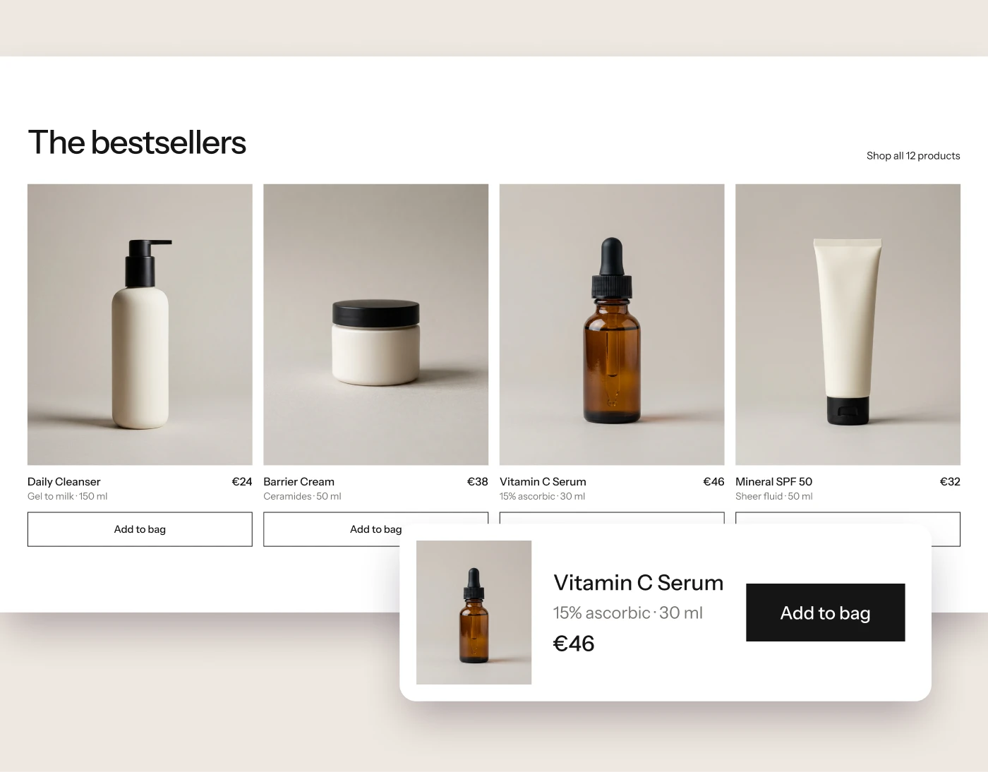
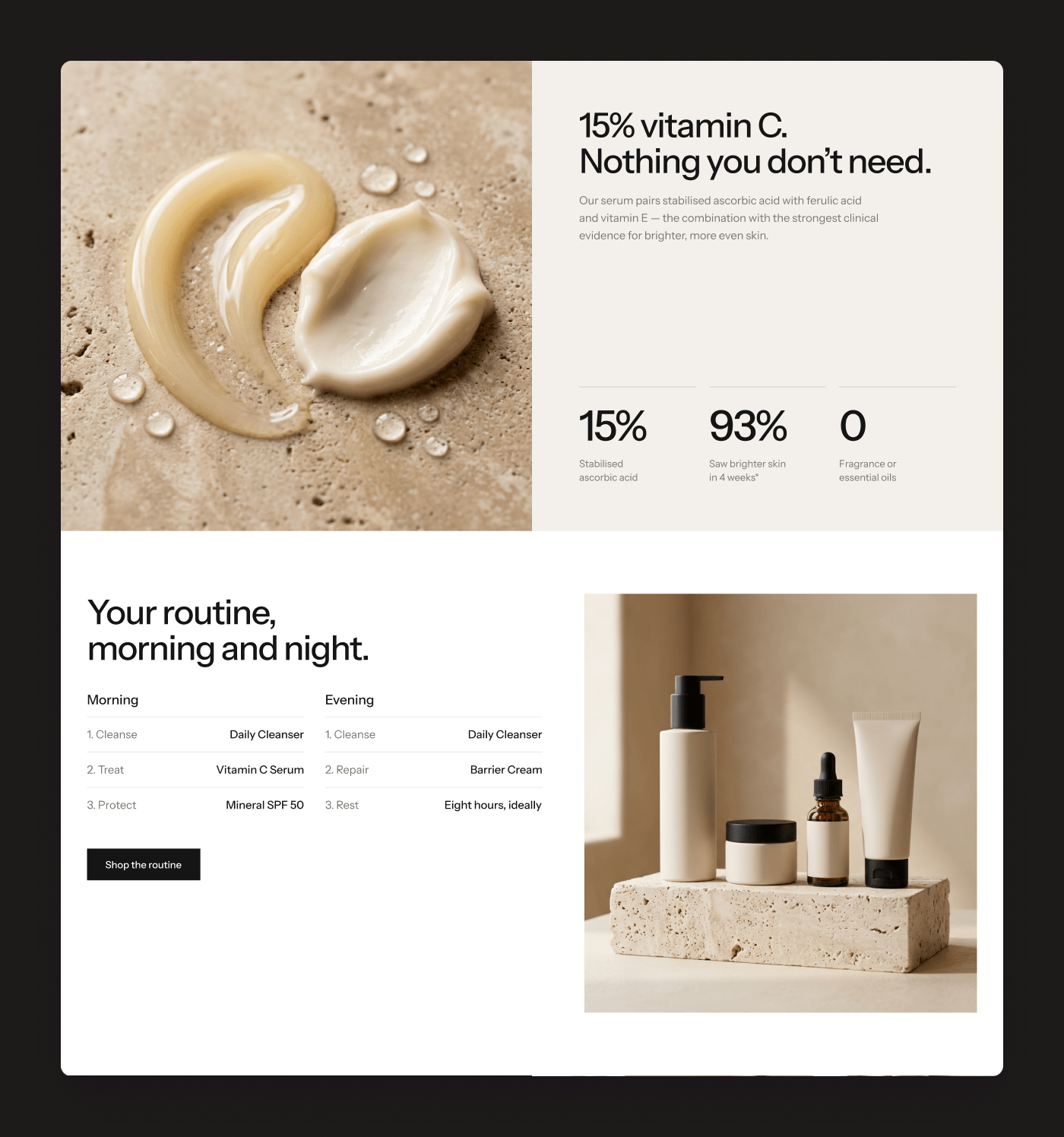
Website design for PRADO, built around a simple skincare routine. I used warm photography, generous spacing and straightforward product cards to give the products room to breathe. The homepage brings together ingredients, morning and evening routines, and refill options, with a consistent visual direction across desktop and mobile.
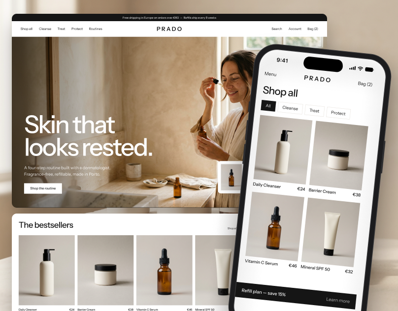
I wanted PRADO to feel warm and easy to shop. I kept the layout simple, with clear product information, room for the photography and sections that explain the daily routine and refill options.
Want a website like this?
Tell me about your project. I'll reply by email within 24 hours.
Request a detailed quote →